
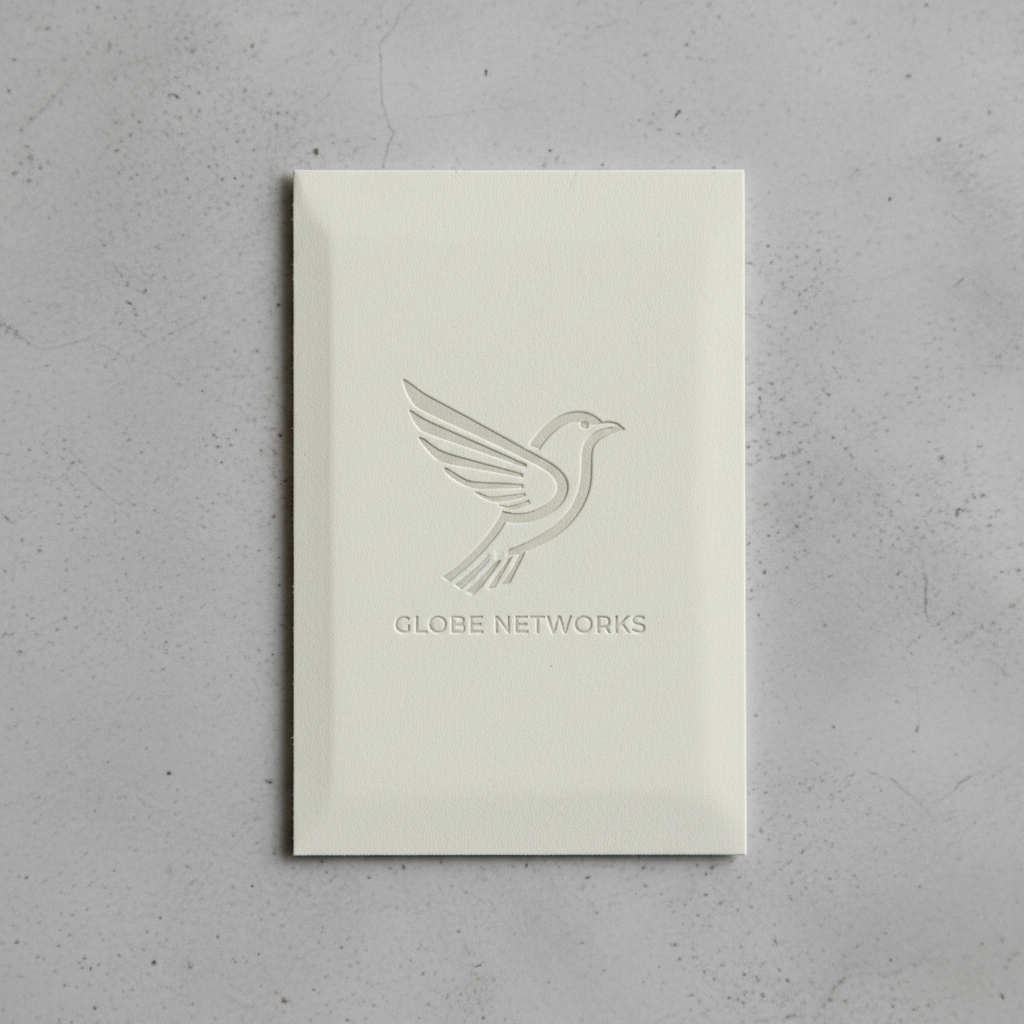

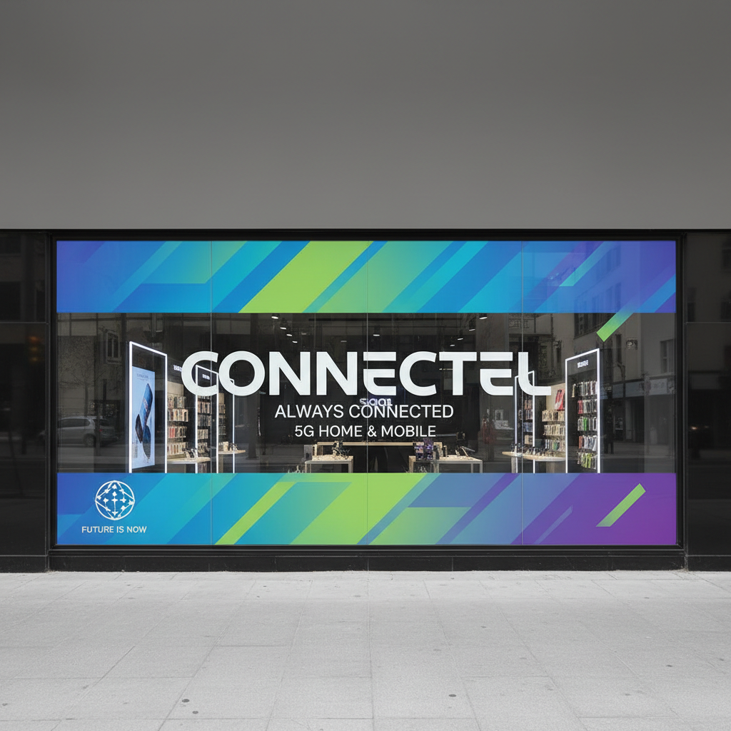
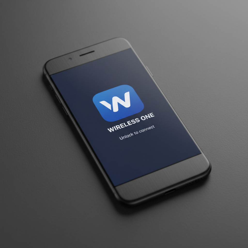
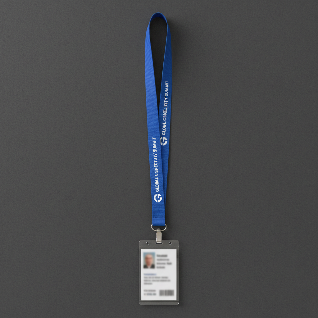
Signal Brand Studio — Est. 2018
We brand the companies
that connect everyone else.
Identity systems for regional carriers, MVNOs, and infrastructure companies — built to survive a billboard at seventy miles per hour.
The name had to work in a Walmart aisle and a Wall Street pitch.
Cascade Mobile came to us with a frequency license, a two-person team, and a PowerPoint deck that said 'friendly' seventeen times. The name 'Cascade' survived our audit — it carried water, flow, and inevitability. What it didn't carry was a reason to choose it over forty other regional carriers using the same liquid metaphor.
We built the naming architecture around a single behavioral truth: Cascade's network covered terrain the big three had written off. Not rural. Not underserved. Unreached. That word became the brand's spine — every carrier leaves gaps; Cascade fills them intentionally.
The tagline landed in three weeks: 'Signal where it counts.' Six words that told their B2B story (tower placement strategy) and their consumer story (reliability in the places that matter) simultaneously. The CMO said it was the first time the company felt like it had a point of view.

"A brand name that only works on a screen has already failed. It needs to survive a truck wrap on I-90 at 75mph."
Mara Okonkwo
Brand Strategist
Formerly Interbrand NYC · 14 years in telecom verticals
We drew 400 letterforms before we found the one that could carry a billion-dollar infrastructure company.
TowerCo Group had been using a licensed sans-serif that cost them $1,200 a year and looked like every other utility company in North America. When they acquired two regional carriers and needed a unified visual identity, the typography problem became structural — the existing letterforms had no room to grow.
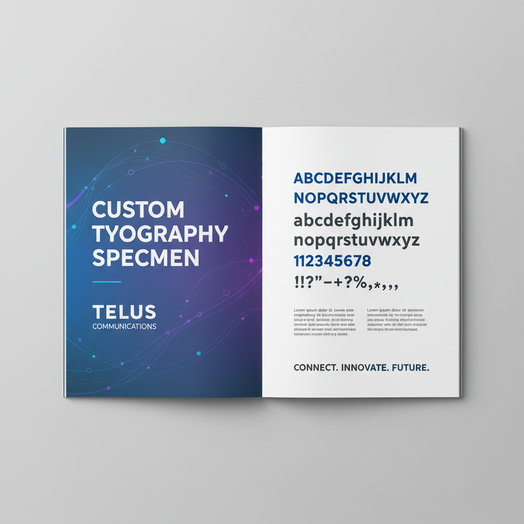
We designed Meridian, a custom grotesque with three distinguishing decisions: the capital G has an open aperture that references a signal arc without illustrating one; the numeral 1 has a full serif to anchor financial documents; the variable weight axis runs from 300 to 800 with a deliberate stall at 550 that we called 'infrastructure weight' — heavy enough to read on a tower sign, light enough for a data plan comparison table.
Meridian shipped with a 47-page type specimen that doubled as an internal brand training document. Every team at TowerCo — from procurement to consumer marketing — received it on day one of the rebrand launch.
"The G in their logo is a signal arc that never once illustrates a signal arc. That's the difference between a mark and a metaphor."
Jonas Pfeiffer
Type Director
Custom type for 9 telecom identities · Trained at Hochschule für Gestaltung
Sixty-four retail locations. One system. Zero compromises on the corner store or the flagship.
NorthLink's retail expansion problem was architectural: they had 64 locations ranging from 280-square-foot kiosks in regional malls to 2,400-square-foot flagship stores in downtown corridors. The previous brand standards assumed a flagship. The kiosk team improvised. The result was 64 different brands wearing the same name.
We built the NorthLink Environment System around three variables: footprint class (micro, standard, flagship), surface type (applied graphics, built environment, digital), and dwell time (transit, browse, consult). Every spec in the system is derived from those three inputs — not from a designer's preference.
The system ships as a 180-page environmental standards document and a Figma library with 340 components. The in-house facilities team can spec a new location without calling us. That was the goal — a system so complete that our involvement becomes optional. Clients who don't need us anymore are the best case studies.

"The best brand system is the one the client can run without you. We built NorthLink's so well they haven't called in eight months."
Diane Castellano
Environmental Design Director
Retail systems for 12 carrier networks · Former IDEO Chicago
Everything we know about
telecom identity, free.
Naming frameworks, type system rationale, environmental standards briefs, and the ten questions every carrier CMO should ask before a rebrand. Forty pages of the thinking we give paying clients — because if you read it and don't hire us, you probably weren't the right fit anyway.
Download the Playbook
Subscribe to
The Press Run
One email a month on telecom identity trends — carrier rebrands we're watching, type decisions worth studying, and the occasional sharp opinion on why gradient swooshes are still ruining the industry.
Recent issues
Why T-Mobile's rebrand aged better than Verizon's
The MVNO naming trap — and how three brands escaped it
Custom type vs. licensed: the infrastructure company calculus
The companies
we've worked with.
From single-state MVNOs to multi-region infrastructure groups — every engagement starts with the same question: what do you stand for that your competitors can't claim?